Moojoy | Design Explorations
- Michelle Angeline
- Aug 2, 2024
- 1 min read


This project was a continuous project from HONOR competition. This is the logo that I did.
Then, I looked around for the heading and body typeface for the brand. I decided to choose these typeface.

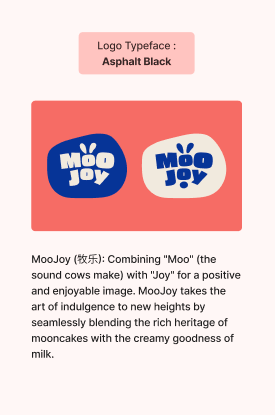
The next thing I did was to find the brand colors. I decided to choose blue and some white for the brand because it matches the most with milk.

I planned to list the products that I wanted to make and create a mascot for the brand, and here is the conclusion from what I made.

The main product would be whole milk followed by some items for the events that I created for the brand that can match my HONOR artwork. I also tried to find some references from Behance and Pinterest. These are the compilations of my design for MooJoy

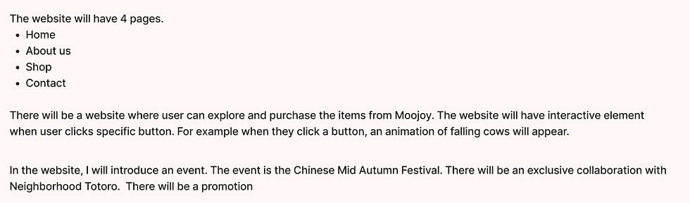
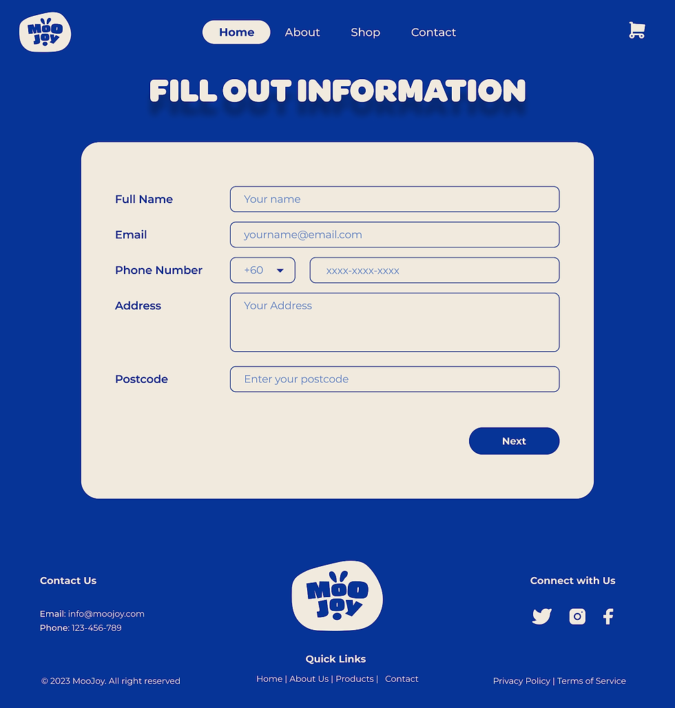
I started to work on the website. The first thing I did was to list what pages I wanted on the website. These are the ideations.
These are the pages for MooJoy Website
Home Page


About Us Page

Shop Page


Contact Page


Comments